
Free shipping on orders in the continental U.S. over $199. Shop Now
Order before May 3rd for guaranteed Mother’s Day arrival.
Original Post: March 10, 2019
Updated: September 10, 2020
Living in the digital age, having an online presence is extremely important. But it’s not enough to just exist on the internet; you need to consider your online image and develop it as part of your brand. Websites for artists are especially important because their work is visual. People want to see examples of your artwork, see your process, find out what inspires you and interact with you. A website is a great platform for these activities to take place. Compared to social media, a website can truly showcase you as an artist all throughout the design of the webpage. You are not limited to the structure, layout and features that a platform like Facebook provides, allowing people to get a better idea of who you are and your brand’s mission.
Think of your website as a central hub dedicated to telling the story of your artistic journey the way you want it to be told. Once you have a successful website up and running, you’ll likely find that it’s an integral part of your business, allowing you to reach a wider audience that you wouldn’t have been able to before
Website builders have made it so anybody can quickly and easily build a quality website at an affordable price. The most popular website builders are Wix and SquareSpace and both have a pretty low learning curve. Basically, you sign up, pick out a template, customize and add content and then you have a website pretty quickly.
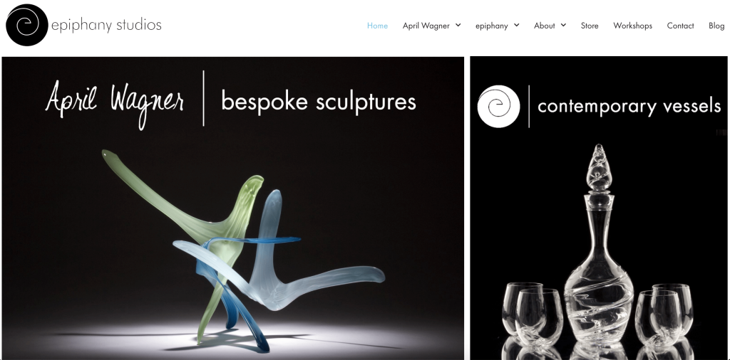
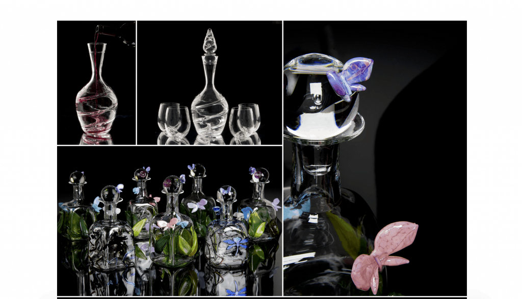
If you’re putting all this time in to making a website to display your artwork, make sure the images are high quality. Learn how to properly photograph your artwork with even lighting and a clean, complementary background. You don’t need to use fancy equipment- utilizing a few simple tricks can help you capture great photos that will do your artwork justice.
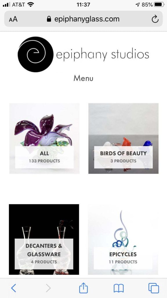
What are some of your favorite websites? What do you like about them? Think both in terms of functionality and aesthetics. In contrast, think about what sites you hate. What are some things that make them frustrating for you to use? Thinking about how you interact with websites and features or design elements that you like or don’t will help you create a more user-friendly webpage.
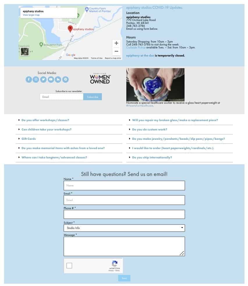
Keep a phone number, email address and physical address (if you have one) in a footer and/or create a designated contact page.
If you want people to reach you, make it easy for them to do that. We recommend having a phone number, because sometimes somebody might want to reach you immediately. If giving out your personal number makes you uncomfortable, you can get a free Google Voice number and have calls forwarded to your phone.
Email contact forms are fine, but we suggest showing an email address as well. Sometimes websites glitch and a form won’t work. If that happens and you have no other means of contact, you just missed out on an important contact. The point of a website is to get people to learn about you and contact you. Don’t leave them with more questions.

You might wonder if you really need a website if you’re already visible on social media. Social media is an important tool but it’s not necessarily a replacement for a website. Social media platforms aren’t really set up for people to find you when conducting Google searches. Generally, they have to search your exact name or business to find you. If you’re a hyper-realistic muralist and you only have a Facebook, it’s a lot more difficult for people to stumble across you on Google unless you already have a large following and people know your name. They may not even come across you on Facebook.
These are just a few ideas you can implement into your website to make it a more successful marketing and business tool. There is no shortage of great resources on the internet to help with building a great webpage, so be adventurous.
How do we do this at epiphany studios? We post daily to Facebook and Instagram, publish a weekly blog and send out a weekly newsletter. We’re working towards providing more exclusive content to our newsletter subscribers. You don’t want to miss out on seeing images and videos of new projects that won’t be posted on social media, so subscribe here!
We hope this post gave you some ideas on how to create a successful webpage. As we said earlier, making the switch to being online is more important than ever. Please share with others who might get use out of it!
Stay up-to-date with us on Facebook or Instagram or sign up for our newsletter. Find more blog posts here. Thanks for your support!